Quiet Luxury Color Palettes: Minimal, Elegant, and Colorful
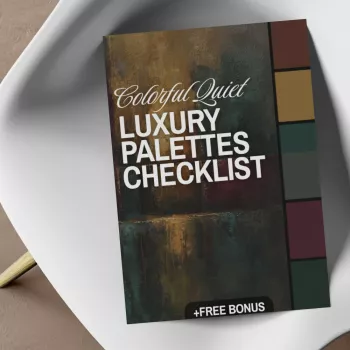
Colorful Quiet Luxury Palettes Checklist: Elegant Color That Stays Minimal
Quiet luxury doesn’t have to mean beige-on-beige. With the right palette rules, color can look refined, modern, and timeless—never loud or trend-chasing. The key is to treat color like a tailored detail: chosen with intention, supported by strong neutrals, and repeated in a calm rhythm. The checklist approach below makes it easy to build elegant color schemes you can reuse across outfits, rooms, and even brand visuals—without overthinking.
What Makes a Palette Feel “Colorful” and Still Quiet
A “quiet” palette isn’t colorless; it’s controlled. The difference is restraint: fewer hues, slightly muted saturation, and finishes that absorb light instead of bouncing it back.
- Choose low-to-moderate saturation over neon. Look for hues that feel “smoked,” “inked,” or “stone-washed.”
- Stay in a tight hue family with small warm/cool shifts instead of stacking unrelated brights.
- Let neutrals do the heavy lifting: off-white, greige, taupe, espresso, ink navy, charcoal, and soft black.
- Control contrast: aim for one contrast moment (trim, bag, shoe, pillow, vase), not contrast everywhere.
- Prioritize quiet materials: matte, brushed, linen, wool, and leather finishes keep color elevated.
- Test in two lights: a palette feels timeless when it works in daylight and warm evening light without turning harsh.
| Lever | Aim | Quick Check |
|---|---|---|
| Saturation | Muted, complex color | Looks rich in shade, not fluorescent in sun |
| Contrast | Intentional and limited | One focal contrast, the rest supportive |
| Temperature | Consistent warmth/coolness | Neutrals match the hero hue’s undertone |
| Finish | Soft, tactile surfaces | Matte/brushed beats glossy for calm elegance |
The Checklist Method: Build a Palette in 10 Minutes
This method keeps the final result minimal because it limits decisions. Instead of collecting “pretty colors,” you’re building a repeatable system.
- Pick a hero color (one). Choose a refined hue you’ll repeat (oxblood, teal, saffron, periwinkle, forest, terracotta, merlot, jade).
- Choose 2 grounding neutrals. One light (ivory, oatmeal, warm white) and one dark (espresso, ink, charcoal).
- Add 1 supporting color. Keep it adjacent on the color wheel (teal + blue-green; terracotta + rust; periwinkle + slate).
- Add 1 metal/finish note. Brushed gold, antique brass, pewter, or matte black—pick one and repeat it.
- Set the ratio. 60% neutral base, 30% hero, 10% accent/metal tends to read premium.
- Decide the edge. Crisp (cleaner lines, higher contrast) or soft (tonal layering, lower contrast).
- Verify in two lights. Daylight and warm lamp light; avoid colors that swing neon or muddy.
- Lock in 3 repeatables. One outfit/room pairing, one accessory/object, one texture.
- Write a no-go list. Remove colors that compete (often opposites on the wheel).
- Save 1 reference image. Minimal silhouette, natural textures, controlled shine.
For color-wheel harmony and quick testing, tools like Adobe Color make it easy to confirm whether your hero hue and support shade stay in the same calm family.
10-Minute Palette Builder
| Choose | How Many | Examples |
|---|---|---|
| Hero color | 1 | Jade, oxblood, deep teal, muted saffron |
| Light neutral | 1 | Ivory, warm white, oat |
| Dark neutral | 1 | Espresso, ink navy, charcoal |
| Support color | 1 | Slate blue, rust, dusty rose |
| Metal/finish | 1 | Brushed gold, antique brass, matte black |
Elegant Color Families (With Built-In Neutrals)
These families are designed to stay calm because they pair a saturated-but-muted hero hue with neutrals that share the same undertone.
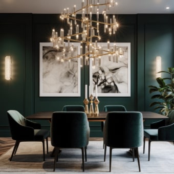
- Jewel-muted: deep teal + ivory + espresso + slate (modern, minimal pattern).
- Earth-polished: terracotta + oat + chocolate + olive (artisanal without going rustic).
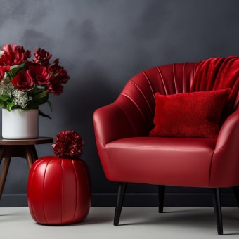
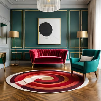
- Berry-ink: merlot + warm white + ink navy + pewter (evening elegance, year-round).
- Citrus-softened: saffron + sand + charcoal + brass (best in small repeated hits).
- Blue-lavender stone: periwinkle + greige + soft black + silver (airy, architectural).
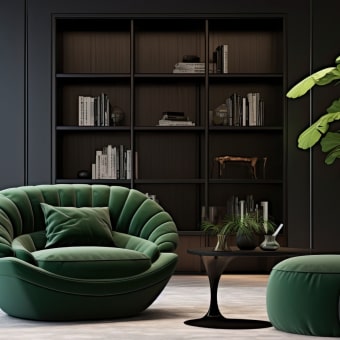
- Green-neutral luxury: forest + bone + camel + antique brass (classic in simple silhouettes).
If you want a professional reference point for hue direction and seasonal shifts, Pantone Color Institute is a reliable way to see how muted color families are described and grouped.
Make It Look Expensive: Proportion, Contrast, and Texture
For spaces where readability matters (signage, labels, digital lookbooks), basic contrast guidance from the W3C Web Content Accessibility Guidelines (WCAG) helps you avoid harsh, vibrating combinations.
Quick Room and Outfit Formulas
| Use | Neutrals | Hero Color | Accent/Metal |
|---|---|---|---|
| Outfit | 70% | 25% | 5% |
| Room | 60% | 30% | 10% |
Digital Checklist: What’s Inside and How to Use It
If you prefer a repeatable system (instead of saving endless swatches), the Colorful Quiet Luxury Palettes Checklist (digital download) organizes the process into clear decisions: hero hue, undertones, neutrals, accent rules, and finish consistency—so your final palette feels elevated and intentional.
If you’re building a more organized “checklist life” beyond color, two other in-stock digital downloads pair well with that structured approach: Soulful Success Checklist: printable goals worksheet and Your Smart Start Checklist for Commercial Property Success (digital download).
FAQ
Can quiet luxury include bright colors?
Yes—keep the bright note slightly muted, limit the number of hues in the palette, and let neutrals and matte textures dominate so the color feels intentional rather than loud.
How many colors should a minimalist palette have?
A practical range is 3–5 total: one hero color, two neutrals, and one optional support/accent plus a single metal or finish note repeated throughout.
What’s the easiest way to stop a palette from looking “cheap”?
Reduce saturation, limit contrast to one focal moment, and prioritize upgraded finishes (matte/brushed, natural textures) with consistent repetition.








Leave a comment