Choose Closet Basic Colors: Neutrals + Accents That Match
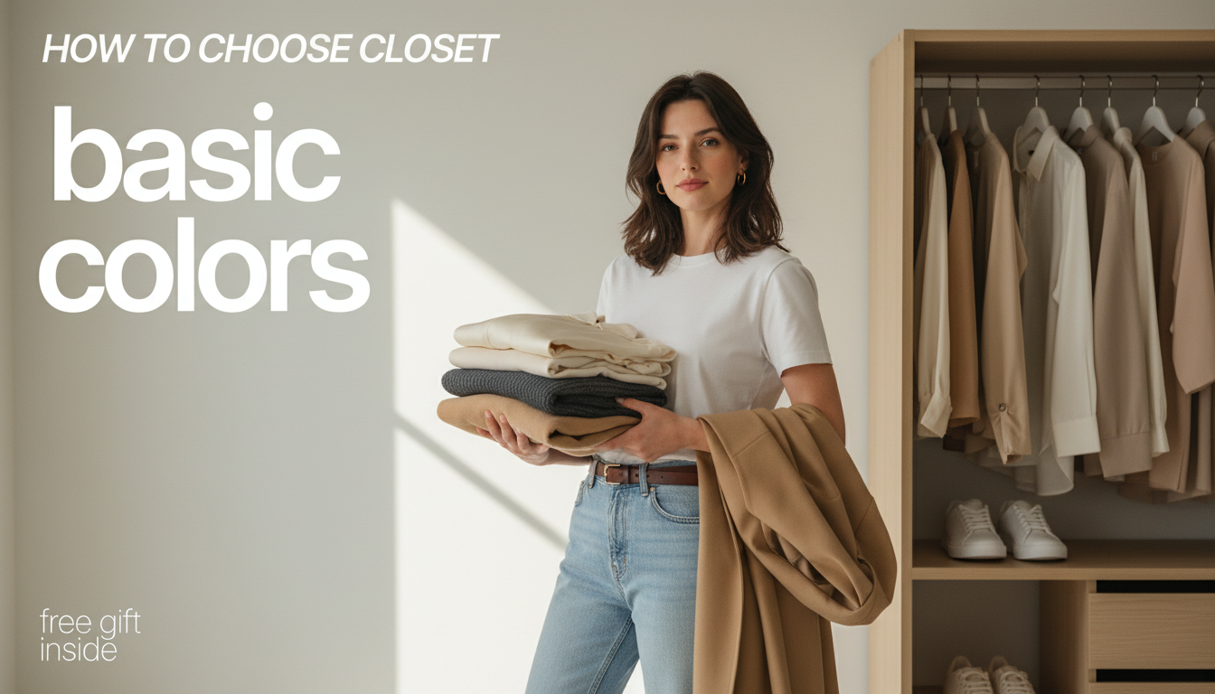
How to Choose Closet Basic Colors (So Everything Matches Without Trying)
Closet basics work best when the colors are intentional: a small set of neutrals that match easily, plus a few accents that flatter your complexion and fit real life. When your palette is consistent, outfits look polished with less effort, shopping gets easier, and “nothing to wear” moments drop fast. Below is a practical way to choose your core colors, prevent common mismatch issues (like clashing whites), and build a wardrobe that stays cohesive across seasons and dress codes. For more guidance, see The Essential Guide to a Sustainable Transitional Capsule Wardrobe.
What “basic colors” really mean (and why they matter)
Basic colors aren’t “boring”—they’re the repeat-wear shades that anchor most outfits across tops, bottoms, outerwear, shoes, and bags. A strong palette reduces decision fatigue because pieces naturally coordinate, which means fewer one-off items and more outfits from the same number of pieces. For further reading, see Developing a Colour Palette for your Wardrobe – Anuschka Rees.
There isn’t one universal best set of neutrals. The right basics depend on lifestyle, undertone, climate, and how much maintenance you’re willing to do (washing, fading, dry cleaning, stain removal). A practical target is a 70/20/10 mix: about 70% core neutrals, 20% supporting neutrals, and 10% accent colors.
Start with your lifestyle: the outfits you actually need
Before choosing a single shade, list your weekly scenarios—work, casual days, events, travel, gym, school pickup, client meetings—and estimate the percentage of time you live in each. That keeps your “best” colors from being theoretical and makes them useful on Monday morning.
Color formality matters. Darker neutrals read more polished (great for tailoring and evening), while lighter neutrals read more casual and warm-weather friendly. Also factor in your laundry reality: if dry-clean-only is rare, prioritize washable fabrics in forgiving shades. If frequent stains are likely (kids, commuting, food service), lean into darker or patterned basics rather than bright solid tops.
Lifestyle-to-neutral match (quick guide)
| Primary need | Best core neutrals | Why it works | Common accents |
|---|---|---|---|
| Office / professional | Navy, charcoal, black, crisp white | Reads structured and pairs cleanly with tailoring | Burgundy, forest green, soft blue |
| Casual / everyday | Mid-wash denim, heather gray, cream, olive | Looks relaxed and hides wear well | Rust, teal, blush |
| Travel / capsule | Black or navy, taupe, white, medium gray | Mixes easily; easy to layer | A single bright scarf or top |
| Warm climate | Cream, sand, light gray, soft navy | Feels lighter and pairs with breathable fabrics | Coral, sky blue, leafy green |
Pick 1–2 core neutrals that look best near your face
Undertone is a useful shortcut. Cool-leaning skin often looks fresh in true white, navy, and charcoal. Warm-leaning skin often glows in cream, camel, warm gray, and olive. The easiest at-home test: in natural light, hold black vs. navy (or white vs. cream) near your face and notice which one brightens your complexion and makes under-eye shadows less noticeable.
Also consider contrast. If your hair/eyes create high contrast (think deep brunette with light eyes, or very dark hair with fair skin), darker cores like black, ink, or navy can look striking. If your overall coloring is lower contrast, medium neutrals like taupe or warm gray can look more harmonious and softer.
Build your neutral system: core, supporting, and bridge colors
Choose accents that repeat easily (without overwhelming the closet)
Avoid the most common color-palette mistakes
Overcorrecting for trends: trend colors work best in low-commitment items while your basics stay stable. If you want inspiration without rebuilding everything, check seasonal direction from the Pantone Color Institute, then translate it into small accent updates.
A simple checklist for editing and rebuilding
Create 10 default outfits from your chosen basics (work, weekend, quick errand, dinner, travel day). If you can’t build 10 without strain, tighten the palette or replace outlier pieces. Finally, plan replacements by impact: a main-neutral pant, a versatile layer, and everyday shoes can make your whole closet feel coordinated quickly. For sustainability-minded edits, the Sustainable Apparel Coalition’s Higg Index overview is a helpful starting point for thinking about materials and impact.
A guided resource for choosing closet basics
If you want a step-by-step walkthrough with prompts and quick comparisons (black vs. navy, white vs. cream, warm vs. cool), see How to Choose Closet Basic Colors – Essential Guide to Building a Versatile Wardrobe. It’s designed to turn “random favorites” into a repeatable color plan you can shop and style with confidence.
If you like using checklists to stay consistent while you declutter and rebuild, Soulful Success Checklist: Your Step-by-Step Guide to Spiritual Goals can also work as a simple framework for setting wardrobe goals (like a no-duplicates rule, a replacement timeline, or a seasonal shopping limit) and sticking to them.
FAQ
How many basic colors should a versatile wardrobe have?
A practical setup is 1–2 core neutrals, 1–3 supporting neutrals, and 2–4 accents. The 70/20/10 balance keeps most pieces easy to combine while still leaving room for personality, and the exact count should reflect how many different dress codes you need week to week.
Is black always the best neutral for closet basics?
Black is ideal when you need a polished look, have a higher-contrast coloring, or want a stain-forgiving wardrobe. If black feels harsh or you prefer softer outfits, navy, charcoal, olive, or camel can be more flattering and sometimes easier to mix with warm accents.
How can a wardrobe include both warm and cool colors without clashing?
Use bridge neutrals like taupe, soft navy, warm gray, or soft white to connect the two temperature families. Keep repetition consistent (the same accents showing up in multiple categories) and choose prints that contain both warm and cool tones so outfits look intentional.










Leave a comment